CsfWebChart
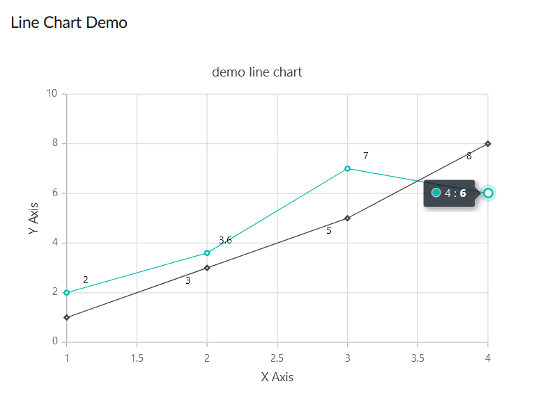
Line Chart Demo

The DataFlex code for the above looks like
      Object oWebChart is a csfWebChart
        Set piHeight to 400
        Set piColumnSpan to 12
        Set psTitle to "demo line chart"
        Set pbTooltip to True
        Object oXAxis is a csfWebChartAxis
          Set peAxisType to chartAxisX
          Set psTitle to "X Axis"
        End_Object
        Object oYAxis is a csfWebChartAxis
          Set peAxisType to chartAxisY
          Set psTitle to "Y Axis"
        End_Object
        Object oFirstSeries is a csfWebChartSeries
          Object oFirstMarkers is a csfWebChartMarker
            Set pbVisible to True
            Object oFirstDataLabel is a csfWebChartDataLabel
              Set pbVisible to True
              Set psPosition to "Top"
              Set psAlignment to "Near"
            End_Object
          End_Object
          Procedure OnAddChartData
            Send AddPoint 1 2
            Send AddPoint 2 3.6
            Send AddPoint 3 7
            Send AddPoint 4 6
          End_Procedure
        End_Object
        Object oSecondSeries is a csfWebChartSeries
          Object oSecondMarkers is a csfWebChartMarker
            Set pbVisible to True
            Set psShape   to "Diamond"
            Object oSecondDataLabel is a csfWebChartDataLabel
              Set pbVisible to True
              Set psPosition to "Bottom"
              Set psAlignment to "Far"
            End_Object
          End_Object
          Procedure OnAddChartData
            Send AddPoint 1 1
            Send AddPoint 2 3
            Send AddPoint 3 5
            Send AddPoint 4 8
          End_Procedure
        End_Object
      End_Object
The Series object has your data.
There are markers (the diamond shapes and the dots) to indicate your data point.
There's also a DataLabel to display the actual value of your data point.
You put the marker object in your series object and customize that… then if you want to do something specific with the dataLabel you add a datalabel object in that and tweak the settings for it.
DataLabel as well as Marker objects are both optional.
This pretty much matches the JSON object definitions as is documented over at SyncFusion.
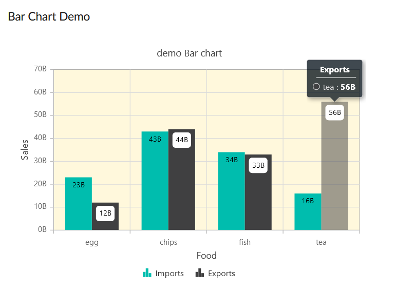
Bar Chart Demo

The DataFlex code looks like:
      Object oWebBarChart is a csfWebChart
        Set piHeight to 400
        Set piColumnSpan to 12
        Set psTitle to "demo Bar chart"
        Set pbTooltip to True
        Object oXAxis is a csfWebChartAxis
          Set peAxisType to chartAxisX
          Set psTitle to "Food"
          Set psValueType to "Category"
        End_Object
        Object oYAxis is a csfWebChartAxis
          Set peAxisType to chartAxisY
          Set psTitle to "Sales"
          Set psLabelFormat to "{value}B"
        End_Object
        Object oBarArea is a csfWebChartArea
          Set psBackground to "cornSilk"
          //Set psBorderColor to "green"
          //Set piBorderWidth to 2
        End_Object
        Object oFirstSeries is a csfWebChartSeries
          //Set psType to "Bar"
          Set psType to "Column"
          Set psName to "Imports"
          Object oFirstMarkers is a csfWebChartMarker
            Object oFirstDataLabel is a csfWebChartDataLabel
              Set pbVisible to True
              Set psPosition to "Top"
            End_Object
          End_Object
          Procedure OnAddChartData
            Send AddPoint "egg" 23
            Send AddPoint "chips" 43
            Send AddPoint "fish" 34
            Send AddPoint "tea" 16
          End_Procedure
        End_Object
        Object oSecondSeries is a csfWebChartSeries
          //Set psType to "Bar"
          Set psType to "Column"
          Set psName to "Exports"
          Object oSecondMarkers is a csfWebChartMarker
            Object oSecondDataLabel is a csfWebChartDataLabel
              Set pbVisible to True
              Set psPosition to "Top"
              Set psFill  to "White"
            End_Object
          End_Object
          Procedure OnAddChartData
            Send AddPoint "egg" 12
            Send AddPoint "fish" 33
            Send AddPoint "chips" 44
            Send AddPoint "tea" 56
          End_Procedure
        End_Object
      End_Object
If you set psType to "Bar' then you have a horizontal bar chart.
If you set psType to "Column" you'll get the vertical bar chart like in the picture above.
Direct SyncFusion Links
Documentation for the API is here:
Tips & tricks here:
SyncFusion Chart control demo:
Updated by Wil van Antwerpen about 1 year ago · 5 revisions